Few brands are more recognizable worldwide than The Coca-Cola Company. The product was created more than 150 years ago, and its popularity is an understatement. President Donald Trump is reportedly consuming 12 cans of Diet Coke per day and even has a special Coke button in the Oval Office.
But while the logo is easily recognizable, it appears to bear some hidden messages. Now, an expert reveals what it actually means.
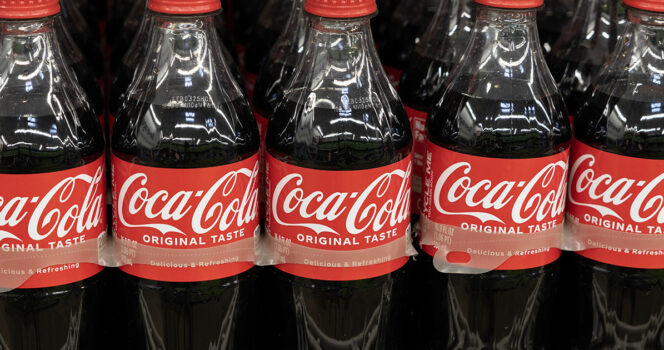
Coca-Cola is one of the most recognizable brands globally. While the company has expanded to create a range of other drinks, designs, and bottles, the Coca-Cola logo remains strong.
The beverage, created in 1886 by Dr. John Pemberton, a pharmacist from Atlanta, Georgia, was sold to Asa Griggs Candler and The Coca-Cola Company in 1892, and the rest is history. The drink became hugely popular in the US, and by the early 20th century, it had become a global phenomenon.
As per their website, Coca-Cola produces 2.2 billion servings of Coca-Cola each day. Some drink it more than others, for example, President Donald Trump.
In 2018, The New York Times reported that Donald Trump drinks 12 cans of Diet Coke daily. The Mayo Clinic has stated that two cans is a “safe amount” of daily caffeine for an adult, as too much caffeine can lead to abnormal heart rhythm and anxiety.
The Coca-Cola logo contains ‘hidden messages’
Moreover, the infamous Coke button Donald Trump was said to have had in the Oval Office during his first term has reportedly been added again. The red color and logo of Coca-Cola are integral to the American way of life.
However, there might be some details of the logo that people have simply not noticed. Now, expert Richard Lau, president of LOGO.com, says it contains hidden messages.
“Businesses cannot overlook the value a great logo holds; they are the connection between a company and potential customers, and what customers will remember most,” Lau said, per the Mirror.
It doesn’t look like anything is hidden in the Coca-Cola logo, and that might be the case. However, according to Lau, it is more about the effectiveness of how it looks.
The expert pointed out that the second “C” has a hidden message. With its extension, it is believed to symbolize a smile. “Subconsciously,” he says, it reflects the company’s emphasis on happiness and joy.
“This subtle message may go unnoticed, but it subconsciously creates a positive association with the brand in the minds of consumers,” Richard Lau added.
Praised online
The Coca-Cola logo was introduced in 1969, and to this day, it remains praised for its style. It has been debated many times, and on social media, particularly on Reddit, it has been a frequently discussed subject.
As per the Mirror, recently, one Reddit user praised its timeless design and others chipped in.
“Also cool to see how it translates across different languages,” a second wrote.
A third user stated: “Ever since someone told me about the faces in the logo I can’t unsee it whenever I look at it,” while a fourth added, “Perfect logo.”
READ MORE
Why you should always have a Coke in the fridge – this trick can save lives